Album Design
Graphic Design
The purpose of album artwork is to capture the identity of the music within. An album’s artwork is typically the first thing we experience before we decide to dive into the music, and first impressions are everything in a highly competitive market. Read on to learn how album art has evolved, how it can amplify the presentation of an album, and how PARMA approaches album design in the modern day.
A Symbiotic Relationship
The relationship between music and artwork is symbiotic in that they both inform each other. Just as a painting is an extension and reflection of its creator’s influences and ideals, album art reflects the personality of the artist and the tone of their music.
The artwork on TELEMANN FANTASIAS from Navona Records uses a unique juxtaposition of photography, a popping color palette, and geometric shapes that all work in harmony with each other, a deceptively simple yet complex cover that’s reflective of the baroque works featured on the album.
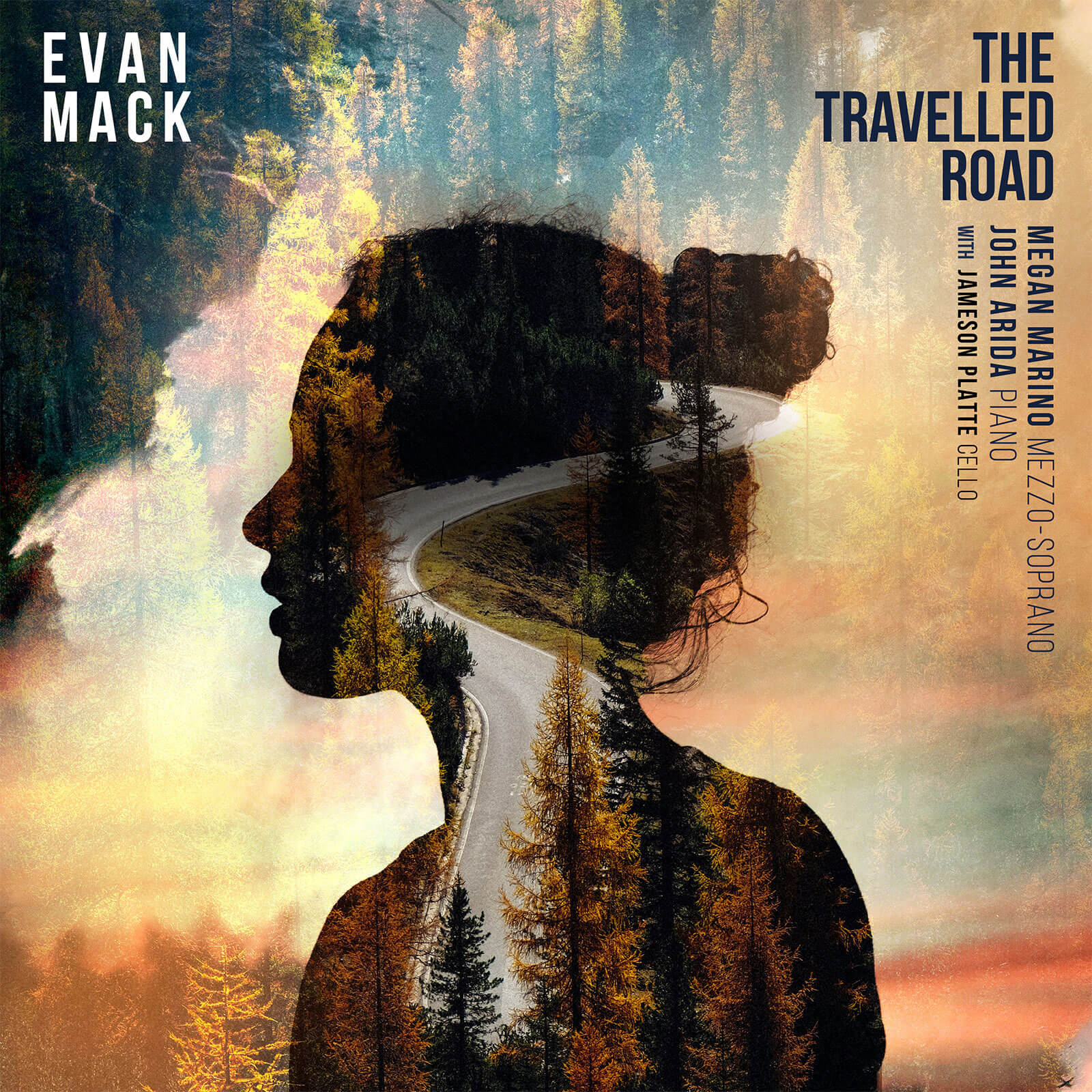
Featuring mezzo-soprano Megan Marino, Evan Mack’s THE TRAVELED ROAD from Ravello Records features the singer’s silhouette fused with the titular concept on the cover, marrying the multiple facets of the album into a compelling visual presentation.
With so many musical genres and artistic voices contributing to music these days, the range of artistic styles in album art has expanded tremendously. Additionally, the tools needed to produce album art have greatly improved with better cameras, graphic design software, and an ease of access to sources and information through the internet.
This growing industry of musical expressions paired with modern technology has created a limitless world of possibility and originality for the visual side of music.
Illustration in Album Design
Even with all of these digital tools at our disposal, the use of illustration in album design still remains a prominent and viable way to stand out in the industry today.
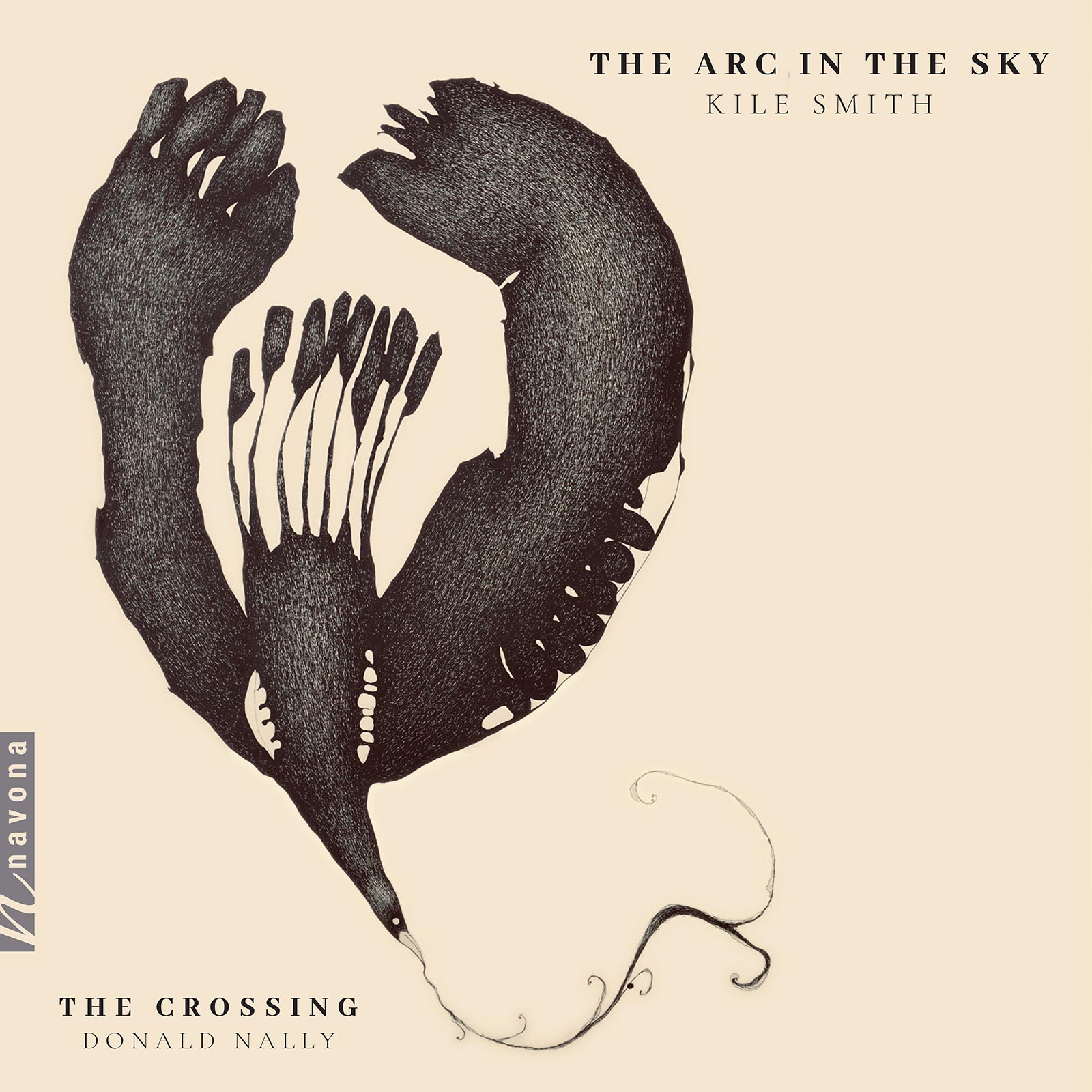
There are a number of different directions a pen and hand can travel. Illustrated by Christopher St. John, the GRAMMY nominated album THE ARC IN THE SKY from The Crossing utilizes a neutral color palette for its cover, its focal point a cascading and imaginatively-drawn bird arcing its wings in flight.
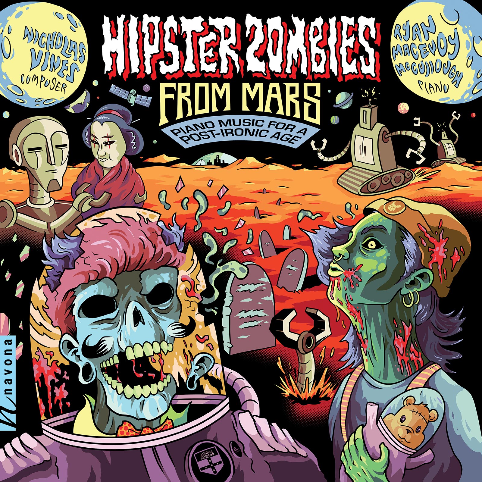
An album title like HIPSTER ZOMBIES FROM MARS surely needs cover art that captures all of those enticing characteristics. Look behind the album’s arresting presentation to find interesting and musically complex works from composer Nicholas Vines.
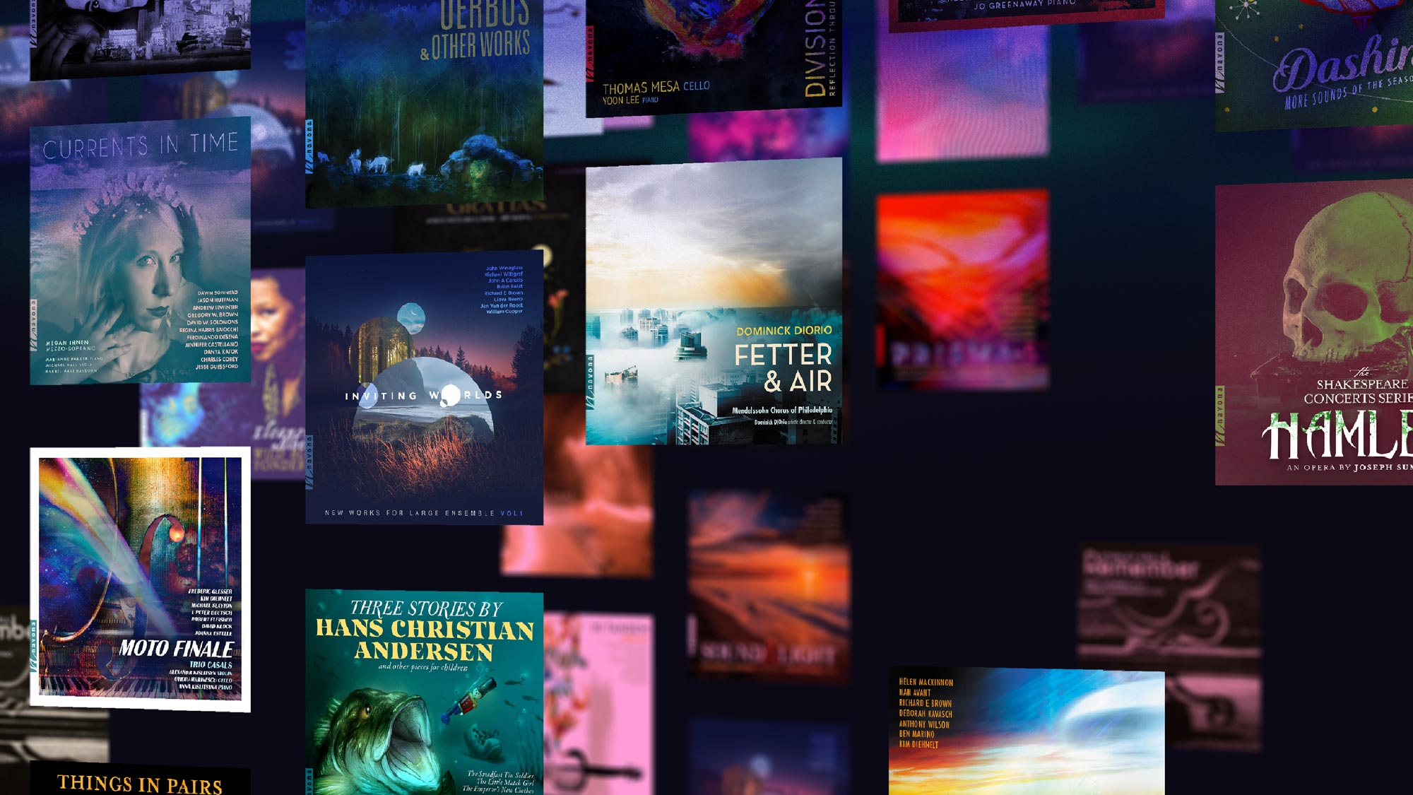
Having unique, eye-catching visuals that both attract and hold the attention of your ideal audience is essential to making your work stand out from the crowd. Before streaming music digitally was the norm, consumers were thumbing through racks of cds and vinyls that grabbed attention far easier. Now that album covers are exposed to listeners in thumbnails on streaming platforms, developing artwork that draws the eye is as crucial as ever in garnering attention.


